Color
Color design tokens, keeping a consistent color scheme around the application.
Colors
Colors in Kaleidoscope are designed to be functional — if you're styling a border, use tokens.color.border rather than reaching for the raw underlying palette color. This means we can apply theming without any extra effort if all colors are using these functional tokens. They also help to maintain the consistent application of colors — because we have a token for borders all of our borders will use the same color.
To use colors, import tokens from @qwilr/kaleidoscope/tokens and pick your color from the object.
import { tokens } from "@qwilr/kaleidoscope/tokens";
export const example = style({  background: tokens.color.surface,});
tokens.color.primarytokens.color.primaryBordertokens.color.criticaltokens.color.criticalBordertokens.color.texttokens.color.textSecondarytokens.color.textPrimarytokens.color.textSuccesstokens.color.textCautiontokens.color.textCriticaltokens.color.textOnPrimarytokens.color.textPlaceholdertokens.color.textOnCriticaltokens.color.textDisabledtokens.color.headingtokens.color.headingSecondarytokens.color.surfacetokens.color.surfacePrimarytokens.color.surfaceSecondarytokens.color.surfaceTertiarytokens.color.surfaceSuccesstokens.color.surfaceCautiontokens.color.surfaceCriticaltokens.color.surfaceHovertokens.color.surfaceActivetokens.color.icontokens.color.iconHovertokens.color.iconActivetokens.color.iconPrimarytokens.color.iconSuccesstokens.color.iconCautiontokens.color.iconCriticaltokens.color.iconDisabledtokens.color.iconOnControlAccenttokens.color.iconOnControlAccentDisabledtokens.color.backgroundtokens.color.bordertokens.color.controlBordertokens.color.controlBorderHovertokens.color.controlBorderFocustokens.color.controlBorderDisabledtokens.color.controlAccenttokens.color.controlAccentHovertokens.color.controlAccentDisabledNaming and usage
There are a few naming conventions within the set of functional color tokens:
| Name | Usage |
|---|---|
text | Text and typography |
textOn... | Text when placed on another color |
surface | Surfaces such as cards and panels as well as anything that layers directly on a surface |
background | The lowest level layer on top of which surfaces sit |
icon | Any interface icon |
control | Interactive elements like buttons and inputs |
border | An outer stroke or line |
primary | Elements to be given emphasis, this is typically also the primary brand color |
secondary | A level of hierarchy down from primary, or from a base color |
tertiary | A level of hierarchy down from secondary |
active | Indicates an active nav item or pressed state |
hover | The hover state color |
focus | The focus state color |
disabled | The disabled state color |
success | Indicates a positive state or message |
caution | Indicates a warning state or message |
critical | Indicates an error or destructive action |
accent | A highlight color for controls |
Theming
Kaleidoscope's functional colors come with light/dark theming out of the box. By default, everything in the application is light themed. To apply a dark theme, use the darkTheme className from tokens.
import { darkTheme } from "@qwilr/kaleidoscope/tokens";
// Both the card and its children will now be dark themedconst Example = () => (  <Card className={darkTheme}>    <Stack padding="m">      <Text size="l">Some text</Text>      <Button>Do the thing</Button>    </Stack>  </Card>);
Opacity
To apply opacity to any color token, use color-mix. This works with both functional color tokens and palette colors, making it the recommended approach over raw RGB values.
import { tokens } from "@qwilr/kaleidoscope/tokens";
export const example = style({  // 20% opacity primary color  color: `color-mix(in srgb, ${tokens.color.primary} 20%, transparent)`,});
The percentage controls how much of the color is mixed in — 20% gives 20% opacity, 70% gives 70% opacity. This also works with palette colors:
import { palette } from "@qwilr/kaleidoscope/tokens";
export const example = style({  background: `color-mix(in srgb, ${palette.purple400} 50%, transparent)`,});
Prefer color-mix over raw RGB values as it works consistently across both functional and palette tokens, and keeps your code simpler.
Palette
This is the fundamental base of all colors in Kaleidoscope. Before reaching for a palette color always check if there is a functional color to pick first, as choosing from the palette means any theming must be handled manually because the colors are fixed and do not adapt to the theme.
To use a palette color, import palette from @qwilr/kaleidoscope/tokens and pick your color from the object.
import { palette } from "@qwilr/kaleidoscope/tokens";
export const example = style({  background: palette.purple400,});
Purple
Blue
Green
Yellow
Orange
Red
Grey
Eggplant
Slate
Midnight
Black
White
Figma
To get the right color from Figma, hop into dev mode and select a layer.
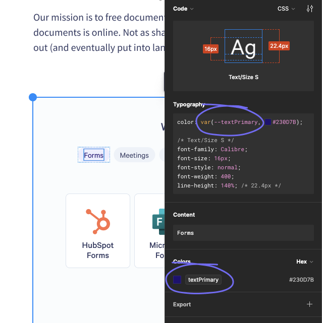
Any color tokens in your selection will show up under colors, and styles for the selected layer will appear in the CSS custom properties syntax. So in this example, the color token in Figma is names textPrimary, and the style shows var(--textPrimary). In Vanilla Extract you can grab the same color from tokens as tokens.color.textPrimary.
Accessibility
The functional color tokens are designed to have AA contrast between surfaces and text/icons. If you use any colors directly from the palette you will need to manually check the contrast for text and icons.