Motion
We use motion in our product to help guide users through a flow, create a thoughtful and considered user experience, and bring moments of delight to a user flow. This is a guide on the principles, properties, and patterns in our motion system. Use this guide to design, customise, and apply motion to components in our product.
When to use this guide
✅ Use this guide when applying animations and transitions to UI components
This includes Kaleidoscope components such as buttons and panels, and also feature-specific components such as comments and folders. This type of motion needs to be functional, should not be distracting, and should assist a user in reaching their goals.
⛔️ Do not use this guide for illustrative visuals in our product
This includes visuals like the bouncing logo in our app loading screen, and the supporting illustration in the trial extension modal. These elements need to be comparatively more expressive to elicit a moment of delight, and therefore do not need to conform to the patterns detailed in this motion guide.
Who should use this
- Designers — should use this guide to learn about the patterns in our motion system, and when to apply these to interactions in our product
- Engineers — should use this guide to learn about our animation tokens
- The wider company — should use this guide as an introduction to our motion principles
Principles
When adding motion to our product, it should embody one or more of the following principles.
Informative
Use motion to inform users of relationships between elements and actions, and to provide visual UI feedback.
Purposeful
Use motion to highlight key actions in a flow, and to attract attention to a specific element on the page.
Delightful
Use motion to create moments of delight in a flow, and to add character to common interactions.
Easing
In the real world, an object moves at varying speeds depending on its size, distance travelled, and elapsed time. We use easing as a method to simulate these real-world physics in our product UI, with the goal of making experiences feel tangible, familiar, and intuitive to interact with.
"Easing curves" describe how fast or slow an element should move at certain points in time along its motion curve. We use 4 set types of easing curves which we define using timing-function tokens.
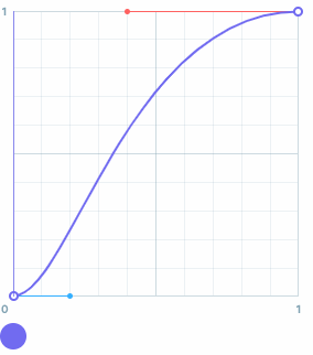
Standard easing
When an existing element is moving between two different points, or is visible during the whole duration of its motion, use bezier-standard. This easing curve tells an element start moving slowly, speed up slightly in the middle, and then slow down again as it stops.
An existing element is one that is visible before beginning its movement.
Persistent elements that are being temporarily hidden from view and can be resurfaced easily can also use bezier-standard. This includes components like tooltips and sidebars.
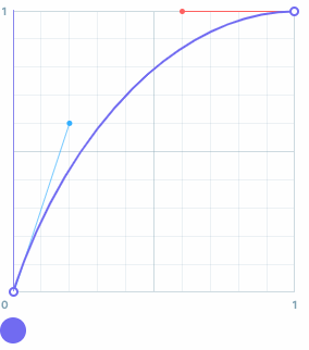
Entry easing
When a new element is being added or is appearing into view, use bezier-entry. This easing curve tells an element to move into view quickly, and then slow down as it stops moving.
A new element is one that is not visible before beginning its movement.
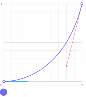
Exit easing
When an existing element is being removed or is disappearing from view, use bezier-exit. This easing curve tells an element start moving slowly, and then speed up as it disappears from view.
An existing element is one that is visible before beginning its movement.
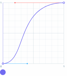
Emphasised easing
When an element needs to grab attention, or needs a snappy motion, use bezier-fastout-slowin. This easing curve tells an element to move quickly, and then slow down over a longer duration as it stops.
⭐ Tokens
| Tokens | Cubic bezier | Usage |
|---|---|---|
bezier-standard | cubic-bezier(0.2, 0, 0.4, 1) | General easing of components |
bezier-entry | cubic-bezier(0.2, 0.6, 0.6, 1) | Entry of components |
bezier-exit | cubic-bezier(0.3, 0, 0.8, 0.2) | Exit of components |
bezier-fastout-slowin | cubic-bezier(0.4, 0, 0.2, 1) |
Duration
We use duration to describe the length of time it takes to complete a motion. When choosing a duration, consider the type of transition, the size of the motion, and the complexity of the component. Generally a long duration is suited to larger transitions, whereas a short duration is suited to smaller transitions.
We use 3 set durations which we define using duration tokens.
Exit transitions
When an element is closed or dismissed, use a shorter duration. This is because exit transitions require less focus compared to other transitions.
| Tokens | ms | Usage |
|---|---|---|
duration-s | 150 | Animations on small components, and exit animations |
duration-m | 200 | Entry animations of small components |
duration-l | 400 | Entry animations of large components |
Transition patterns
Sequencing
If a component is composed of multiple moving parts, try offsetting the transition start time of the individual elements. This is called sequencing. Doing this can help create focus inside a complex component, guide the users' attention, and visually group related elements.
We typically use a 50ms timing delay between moving elements.
Translate & fade
A translate & fade transition can be used to establish a relationship between an existing element on screen, and a new element that's being introduced.
As a general rule of thumb —
- Use
8pxas the translate value for piece components & small transitions (e.g. tooltips) - Use
16pxas the translate value for small pattern components & medium transitions (e.g. comment thread panel) - Use directionality of movement to convey and reinforce continuity in a flow or relationships between elements (e.g. moving forward/backward in the sign up flow, button tooltip)
Scale & fade
A scale & fade transition can be used to add or remove an element when it has no direct relationship to a specific part of the view, or when the element is being 'housed' inside a smaller element.
As a general rule of thumb —
- Use
0.8as the scaling value - Where applicable, use directionality of movement to convey and reinforce relationships between elements (e.g. a comment marker & thread panel)

Accessibility
Some users experience motion sickness from elements that move or scale on-screen, and will set their motion preference to reduced in their operating system preferences. This does not mean that animation can't be used, but does mean that we need to consider how interactions appear to these users.
For designers —
- Always provide an alternative variation for animations that include
translateorscaleproperties - A good rule of thumb is to replace the above with an
opacityfade, so that elements can still gradually appear, but are less likely to trigger motion sickness
For engineers —
- Remember to use the provided animation variant inside a
prefers-reduced-motion: reducemedia query - Test reduced animation variants with the OS reduced motion accessibility setting turned on. Alternatively, under the rendering tab in Chrome devtools you can set
Emulate CSS media feature prefers-reduced-motiontoreduce.