Spacing
Spacing design tokens, usable throughout the application to provide harmonic spacing.
Tokens
To use spacing, import tokens from @qwilr/kaleidoscope/tokens and pick your spacing size. Try to always use a spacing token instead of arbitrary pixel values.
import { tokens } from "@qwilr/kaleidoscope/tokens";
export const example = style({  padding: tokens.spacing.xl,});
tokens.spacing.xxxstokens.spacing.xxstokens.spacing.xstokens.spacing.stokens.spacing.mtokens.spacing.ltokens.spacing.xltokens.spacing.xxltokens.spacing.xxxlBreakpoints
For responsive styling there are preset breakpoints to ensure consistency with device-width styling. Breakpoints are mobile first, meaning base styles not in a media query are used for mobile, and media queries are used for defining specific styles for larger devices.
To create responsive styles in Vanilla Extract, you can import and use these breakpoints. In the example below, the style will use s padding for mobile, m for tablet, l for laptop, and xl for desktop. If you are writing styles for desktop only there's no need to wrap everything in the desktop breakpoint, it's only needed when you have differing styles for device widths.
import { breakpoint } from "@qwilr/kaleidoscope/tokens";
export const example = style({  padding: tokens.spacing.s,  "@media": {    [breakpoint.tablet]: {      padding: tokens.spacing.m,    },    [breakpoint.laptop]: {      padding: tokens.spacing.l,    },    [breakpoint.desktop]: {      padding: tokens.spacing.xl,    },  },});
breakpoint.tabletbreakpoint.laptopbreakpoint.desktopComponents
The same spacing tokens are used in layout components such as for its gap and padding values. Responsive spacing values also correspond to the above device width breakpoints.
Figma
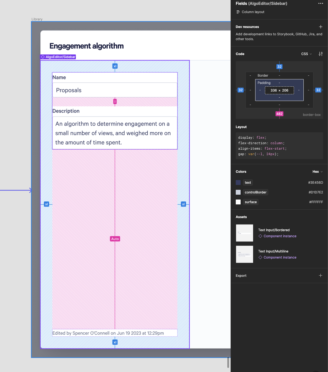
If a design is using auto layout in Figma, you can 1:1 derive the spacing tokens for use directly or in a Stack. If you see pixel values instead, look up the corresponding token in the table above.
