Stack
General purpose layout component with consistent spacing and positioning
Stack is a layout component that acts as an abstraction over flexbox that has all of our spacing tokens baked into it. It allows you to easily add spacing, padding, alignment and positioning to a set of elements.
Default
By default, Stack will set up a flexbox container with elements flowing in a column (i.e.flex-direction: column) with no spacing, padding or other positioning logic.
Editable example<Stack style={{outline: "1px solid red"}}>
  <Card style={{width: "400px", maxWidth: '75vw', padding: "24px"}}>
    <Text>Element</Text>
  </Card>
  <Card style={{width: "400px", maxWidth: '75vw', padding: "24px"}}>
    <Text>Element</Text>
  </Card>
</Stack>
Basic usage
Here's a simple example where we want some buttons set inside a Card, with padding inside the card and even spacing between the buttons.
Editable example<Card>
  <Stack gap="m" padding="l">
    <Button>
      Do the thing
    </Button>
    <Button>
      Don't do the thing
    </Button>
    <Button>
      Maybe do the thing
    </Button>
  </Stack>
</Card>
Gap
Gap mirrors the equivalent gap property in CSS flexbox, adding spacing between each element inside the Stack.
Editable example<Card>
  <Stack gap="l" padding="m">
    <Stack gap="xs" align="start">
      <ExampleContent padding="m">
        <Text>XS gap</Text>
      </ExampleContent>
      <ExampleContent padding="m">
        <Text>XS gap</Text>
      </ExampleContent>
    </Stack>
    <Stack gap="xxl" align="start">
      <ExampleContent padding="m">
        <Text>XXL gap</Text>
      </ExampleContent>
      <ExampleContent padding="m">
        <Text>XXL gap</Text>
      </ExampleContent>
    </Stack>
  </Stack>
</Card>
Padding
Padding applies spacing to the interior of the Stack. It can be applied uniformly or tweaked per-side.
Editable example<Card>
  <Stack gap="l" padding="s">
    <Heading strong level="3">
      Symmetric padding
    </Heading>
    <ExampleContent padding="m">
      <Text>Some content with m padding</Text>
    </ExampleContent>
    <ExampleContent padding="xxl">
      <Text>Some content with xxl padding</Text>
    </ExampleContent>
    <Heading strong level="3">
      Asymmetric padding
    </Heading>
    <ExampleContent padding="s" paddingTop="xxxl">
      <Text>Some content with s padding and xxxl padding top</Text>
    </ExampleContent>
    <ExampleContent padding="s" paddingRight="xxxl">
      <Text>Some content with s padding and xxxl padding right</Text>
    </ExampleContent>
    <ExampleContent padding="s" paddingBottom="xxxl">
      <Text>Some content with s padding and xxxl padding bottom</Text>
    </ExampleContent>
    <ExampleContent padding="s" paddingLeft="xxxl">
      <Text>Some content with s padding and xxxl padding left</Text>
    </ExampleContent>
    <ExampleContent padding="s" paddingLeft="xxxl" paddingRight="xxxl">
      <Text>Some content with s padding and xxxl padding left & right</Text>
    </ExampleContent>
    <ExampleContent padding="s" paddingTop="xxxl" paddingBottom="xxxl">
      <Text>Some content with s padding and xxxl padding top & bottom</Text>
    </ExampleContent>
  </Stack>
</Card>
Direction
Controls whether elements flow along the horizontal or vertical axis.
Editable example() => {
  const [direction, setDirection] = React.useState("horizontal");

  return (
    <Stack gap="m">
      <Stack direction="horizontal" gap="s">
        <Button onClick={() => setDirection("horizontal")}>
          Horizontal
        </Button>
        <Button onClick={() => setDirection("vertical")}>
          Vertical
        </Button>
      </Stack>
      <Stack padding="m" gap="m" direction={direction}>
        <ExampleContent padding="m">
          <Text>Some {direction} content</Text>
        </ExampleContent>
        <ExampleContent padding="m">
          <Text>Some {direction} content</Text>
        </ExampleContent>
        <ExampleContent padding="m">
          <Text>Some {direction} content</Text>
        </ExampleContent>
      </Stack>
    </Stack>
  );
}
Responsive values
Padding and gap props all allow setting values to apply at specific responsive breakpoints. This allows you to customise gap and padding to fit different screen sizes better.
Here's an example that changes the gap spacing between the ExampleContent elements based on viewport, and the padding inside each ExampleContent:
Editable example<Stack gap={{ default: "s", tablet: "m", laptop: "l", desktop: "xl" }} direction="vertical" padding="s" style={{background: tokens.color.surface}}>
  <ExampleContent padding={{ default: "s", tablet: "m", laptop: "l", desktop: "xl" }}>
    <Text>Resize viewport width to see spacing change</Text>
  </ExampleContent>
  <ExampleContent padding={{ default: "s", tablet: "m", laptop: "l", desktop: "xl" }}>
    <Text>Resize viewport width to see spacing change</Text>
  </ExampleContent>
  <ExampleContent padding={{ default: "s", tablet: "m", laptop: "l", desktop: "xl" }}>
    <Text>Resize viewport width to see spacing change</Text>
  </ExampleContent>
</Stack>
Usage with Figma designs
Stack also works really well with auto-layout in Figma, you can directly plug in the spacing tokens as padding/gap values from dev mode.
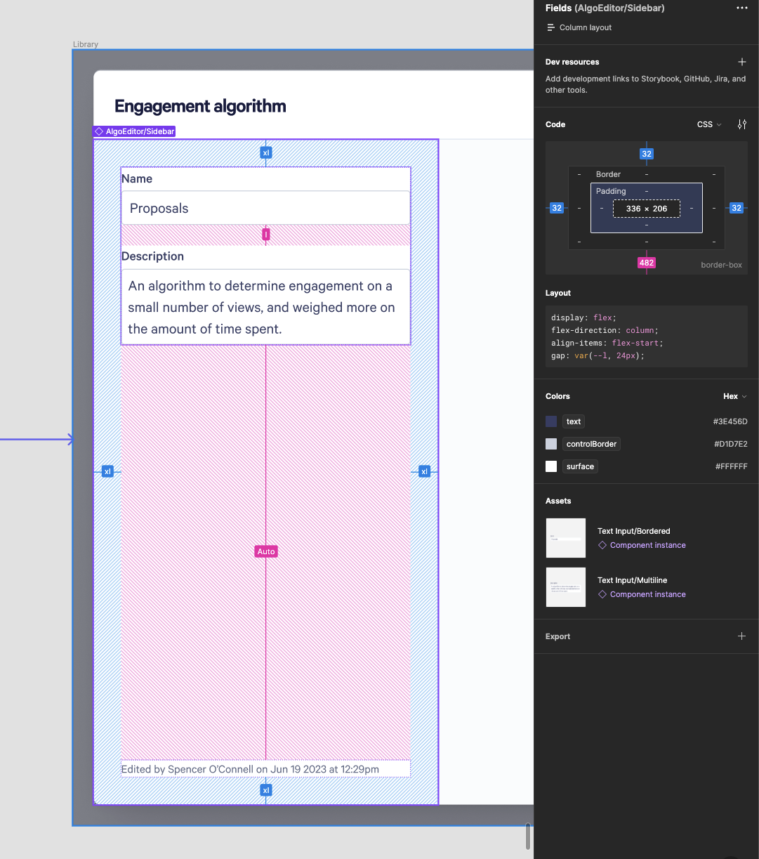
Note you’ll only get the nice s, m, l values if the design is using auto-layout (and the designer has selected a spacing var for all the gaps/padding), which we don’t always use for everything. If you see raw pixel values you’ll still need to translate them to use the .