Less tokensDeprecated
Colors, spacing, controls, and typography tokens used when writing styles in LESS.
Color
Color design tokens, keeping consistent color scheme around the application.
This is the fixed color set the application uses as base colors. Each of these can be used via their LESS token value.
Semantics
Stick to a consistent meaning for colors within the UI so that experiences don't break customer expectations.
- Green: Success states and primary actions (e.g. confirmations)
- Red: Error states and destructive actions (e.g. deletion actions)
- Orange: Warnings and non critical errors
- Blue: Highlights and focus states (e.g. indicator that an element has focus)
Usage with Figma
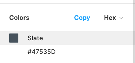
Generally, there is a mapping between a color used in a design with a base color in the design system. The name of the color should be reflected in a Figma design, in the inspect pane, as below:

We also use transparency to tone colors down, or add opacity; this is usually done in code via a LESS mixin.
For example, Blue-50 in a Figma, which is blue with a 50% opacity channel applied, would correspond in code to:
fade(@blue, 50)
Best practice
- Avoid specifying colors directly by their hex or RGB(A) color code, and use LESS tokens or CSS variables where possible
- Where possible, if a bespoke color is used in design, look for the nearest color above
Accessibility
- When selecting colors for foreground elements like text, ensure that the color passes WCAG AA contrast of 4.5:1 against its background color. Validation of this can be performed in Storybook, or through a contrast checker site
- For non-text content such as icons, there should be a contrast of at least 3:1 against the background color
- Avoid using color as the only point of semantic distinction. For example, instead of only using a red color to indicate an error, pair it with an error icon so it still clear for color blind users.
Spacing
Spacing design tokens, usable throughout the application to provide harmonic spacing.
Note that LESS variables are only available in LESS builds, and tokens are only available in VE builds. A small number of pixel sizes aren't available as LESS variables.
We provide a series of spacing mixins; these are useful for ensuring that all spacing used in our application are in harmony. Where possible, use these instead of raw values.
| LESS variable | VE token | Pixel size |
|---|---|---|
| N/A | tokens.spacing.xxxs | 2px |
@space-xs | tokens.spacing.xxs | 4px |
@space-s | tokens.spacing.xs | 8px |
| N/A | tokens.spacing.s | 12px |
@space-m | tokens.spacing.m | 16px |
@space-l | tokens.spacing.l | 24px |
| N/A | tokens.spacing.xl | 32px |
@space-xl | tokens.spacing.xxl | 40px |
| N/A | tokens.spacing.xxxl | 48px |
Mixins
Note: These are only available in LESS builds now, and are deprecated. These can mostly be replicated through the use of the Stack component.
Beyond that, we also provide a bunch of class mixins to quickly apply spacing for common use cases.
Inset
Useful for padding inside a container.
.space-inset-m
.space-inset-m;
Inset squish
For "squished" asymmetrical padding like in buttons; top and bottom padding is 50% of left and right padding.
.space-inset-squish-m
.space-inset-squish-m;
Inline
Useful for margins to the right of inline elements.
.space-inline-m
.space-inline-m;
Stack
Useful for margins after stacked blocks.
.space-stack-m
.space-stack-m;
Best practice
- Where possible, keep to these fixed variables for spacing rather than magic numbers; this will ensure the application's whitespace is evenly applied
- Use the
gapproperty forflexandgridparents to apply spacing between their children rather than applying the spacing to the children
Reference guide
Note: These are only available in LESS builds now, and are deprecated. These can mostly be replicated through the use of the Stack component.
| Variable | Pixel | Inset | Inset-squish | Inline | Stack |
|---|---|---|---|---|---|
@space-xs | 4px | .space-inset-xs | .space-inset-squish-xs | .space-inline-xs | .space-stack-xs |
@space-s | 8px | .space-inset-s | .space-inset-squish-s | .space-inline-s | .space-stack-s |
@space-m | 16px | .space-inset-m | .space-inset-squish-m | .space-inline-m | .space-stack-m |
@space-l | 24px | .space-inset-l | .space-inset-squish-l | .space-inline-l | .space-stack-l |
@space-xl | 40px | .space-inset-xl | .space-inset-squish-xl | .space-inline-xl | .space-stack-xl |
Controls
Control design tokens, usable throughout the application to build consistent and accessible interactive controls.
Glossary
Control: A UI element that takes input events; examples of these include the Button, TextInput and Dropdown.
Surface: A UI element that contains other UI elements; examples of these include the Card, Panel and Popover.
Variables
We provide a series of variables for standard control and surface sizing.
| Variable | Pixel size |
|---|---|
@control-size-x-small | 24px |
@control-size-small | 32px |
@control-size-medium | 40px |
@control-size-large | 62px |
@control-border-radius | 4px |
@control-focus-ring-size | 3px |
Focus ring mixin
We provide a Qwilr-specific focus ring mixin that can be used for building accessible controls.
Add it to your control's CSS with .control-focus-ring.
Editable example<button className="control-focus-ring">
  Focussable button
</button>
Typography
Typography design tokens, usable throughout the application to provide consistent font styles.
🚨 These tokens are deprecated
Only use these for reference when working with the old typographic hierarchy. Avoid using these for any new interfaces, and instead use the new , , and components.
Mixins
We provide a series of mixins for typography; these can either be used directly as classes on elements, or can be reused via a LESS mixin.
These mixins provide consistent values to match our design tooling, most of which shouldn't be overridden. Things that can be manually set:
- text color
- spacing around text
- text alignment
Figma mapping
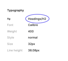
Currently there's a slight mismatch between text styles defined in Figma vs our text mixins. To find a text style in Figma, select the text, then you should see a section labelled Typography in the inspect panel. Next to the Ag icon will display the text style name, e.g. Headings/H2. If it's empty no text style has been used.

| Figma text style | Less mixin |
|---|---|
| Headings/H1 | .text-h1 |
| Headings/H2 | .text-h2 |
| Headings/H3 | .text-h3 |
| Headings/H4 | .text-h4 |
| ??? | .text-h5 |
| ??? | .text-large-label |
| Labels/Large Label | .text-medium-label |
| Labels/Context Label | .text-context-label |
| Labels/Small Label | .text-small-label |
| Body/Paragraph | .text-paragraph |
| Body/Description | .text-description |
Headings
Use headings to title sections of a view in a hierarchical order.
Heading 1
.text-h1;
.text-h2;
.text-h3;
.text-h4;
.text-h5;
Labels
Use labels to label inputs, or to provide a small contextual label to related elements. Avoid using the all-caps variants (large, context, and small) for text longer than a few words.
Large label
.text-large-label;
.text-medium-label;
.text-context-label;
.text-small-label;
Body
Use body mixins for blocks of text such as descriptions or paragraphs.
Paragraph
.text-paragraph;
.text-description;
Best practices
- Stick to using the above text mixins. If there's custom text in a design check with the designer that this is intentional before applying custom text styles.
- In Figma, only the color, alignment, and spacing of a text mixin can be overridden. Likewise, in css we should avoid overriding any properties except
color,text-alignandmargin/paddingwhen using text mixins. - Avoid using the lower level
.text-size-xand font weight mixins or directly stylingfont-weight,font-size, andline-heightunless an explicit decision has been made to opt out of the base hierarchy mixins.
Accessibility
- Headings are used by screen readers as a way to navigate pages. For this reason it's important to use HTML heading tags
<h1>,<h2>,<h3>,<h4>,<h5>, and<h6>. - Always use HTML elements for headings that descend in a meaningful order without skipping levels. The headings size can be used independently of HTML elements. For example, the main title of a page might be styled as
.text-h2, but because it's the first heading, it should use an<h1>HTML element. - When overriding a heading's color, make sure the color passes WCAG AA contrast of 4.5:1 against its background color. The exception to this rule is if the text is within a disabled UI element, which has no minimum contrast requirement.
Surfaces
| Variable | Elevation | Theme |
|---|---|---|
@surface-elevation-0 | 0 | light |
@surface-elevation-1 | 1 | light |
@surface-elevation-2 | 2 | light |
@surface-elevation-3 | 3 | light |
@surface-elevation-0-dark | 0 | dark |
@surface-elevation-1-dark | 1 | dark |
@surface-elevation-2-dark | 2 | dark |
@surface-elevation-3-dark | 3 | dark |
Border radius
Standard border radius for surfaces
| Variable | Pixel size |
|---|---|
@surface-border-radius | 8px |
Background
Standard background color for surfaces
| Variable | Color |
|---|---|
@surface-background | white |
@surface-background-dark | @midnight |